s
log

LogoType
PROJECT SPECS
2019, 5 weeks
MY ROLE
Grpahic Designer, Exhibition Artist
PROGRAMS
Ai CC, InD CC, Glyphs
TAGS
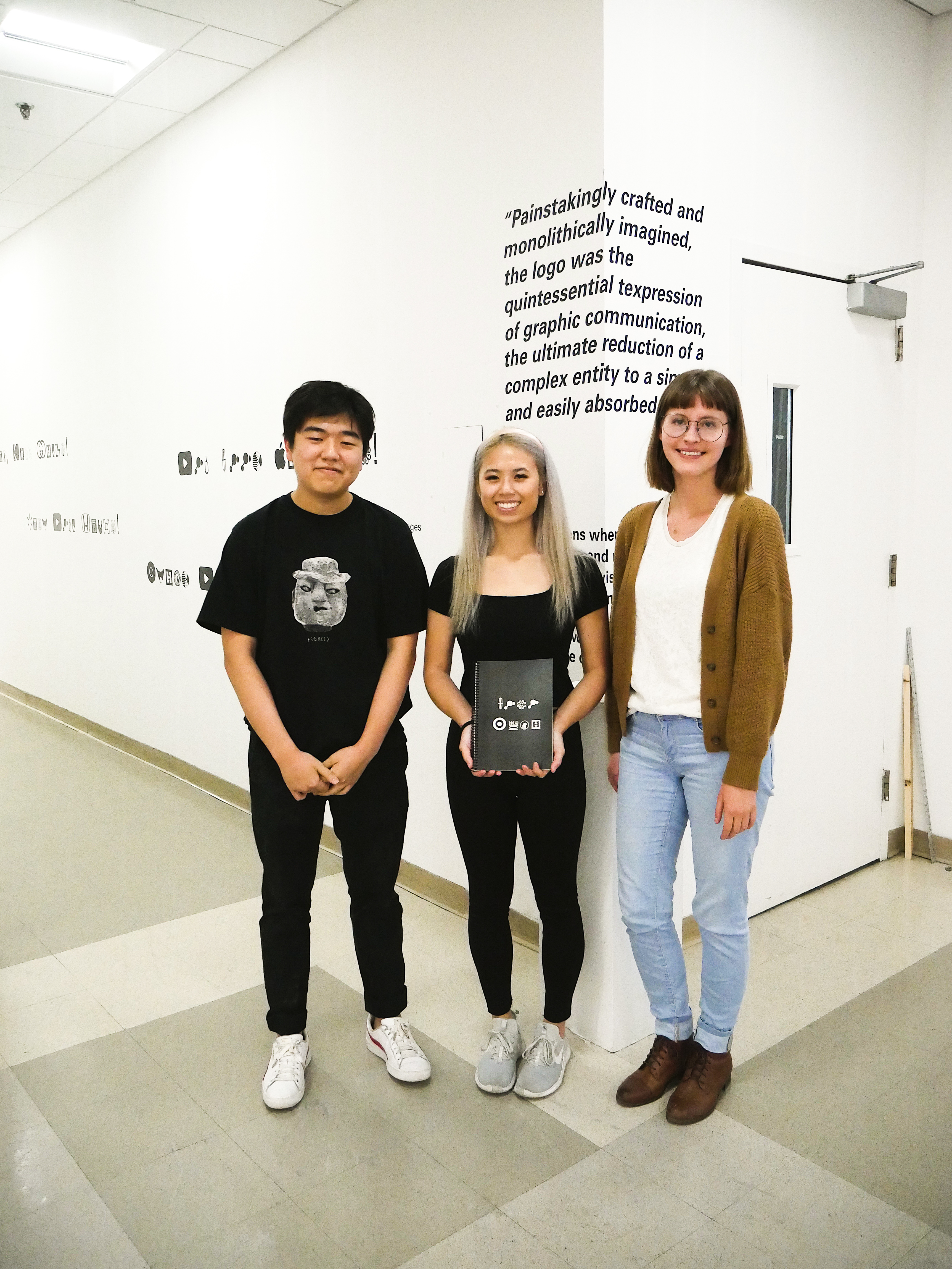
Poster, Typeface, Video, Vinyl, Editorial, Partners / Alicja Wisniowska & Andrew Kim
CHALLENGE / REQUIREMENTS
“...graphic design must be seen as a discipline capable of generating meaning out of its own intrinsic resources without reliance on commissions, functions, specific materials or means”
— Andrew Blauvelt
![]()
![]()
![]()
![]()
![]()
Challenge
Create a design exhibition inspired by Graphic Design: Now in Production (a broad-ranging view of graphic design, originally exhibited at the Walker Art Center in Minneapolis, Minnesota)
Requirements
» A0 poster
» Video book/object
» wall graphic / text wall plaque
» must use vinyl cutter
» pedestal
» laser printer / foam core
» Using plotter
» Using monitor
— Andrew Blauvelt


Challenge
Create a design exhibition inspired by Graphic Design: Now in Production (a broad-ranging view of graphic design, originally exhibited at the Walker Art Center in Minneapolis, Minnesota)
Requirements
» A0 poster
» Video book/object
» wall graphic / text wall plaque
» must use vinyl cutter
» pedestal
» laser printer / foam core
» Using plotter
» Using monitor
RESEARCH
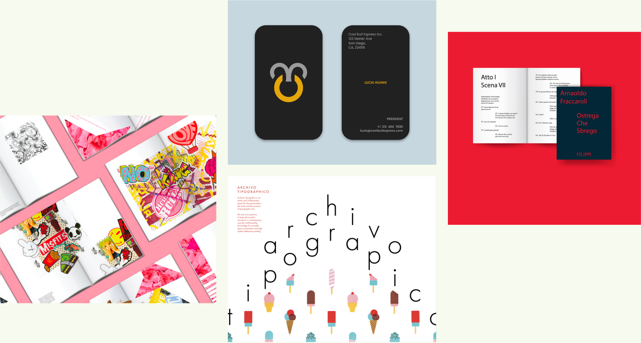
In this project, the book Graphic Design: Now in Production was used as a reference for which to base the design of an exhibition. Our group—Andrew, Alicja, and I—got together to first decide on an article, and then to toss around ideas of how we were going to go about execute a number of deliverables in response to our reading. These deliverables include a printed A0 poster, wall plaque, video, and book.
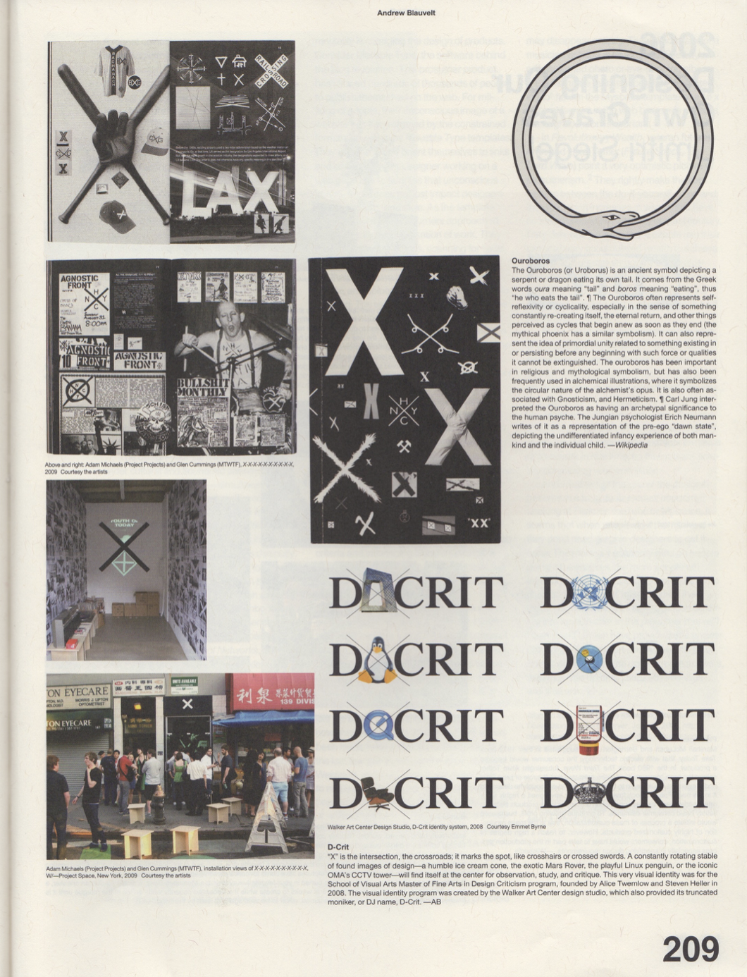
Brand New Worlds by Andrew Blauvelt is a meaty article that talks about a lot of different concepts. It gave us the history of logos and corporate identity, offered a series of logo redesigns, and discussed heraldry among other topics. What excited us were logos. There are thousands of them out there, and yet they are constantly being redesigned or updated to fit in with different societal views or to align with changed company missions. We first looked at logo redesigns and tried to find a way to pull an interested concept out of changed designs over time. In the end we found that direction would have lead to a project that was more research based than we would have liked. We tried something else, and compiled a collection of local and global logos to match with the letters of the alphabet.
TYPEFACE
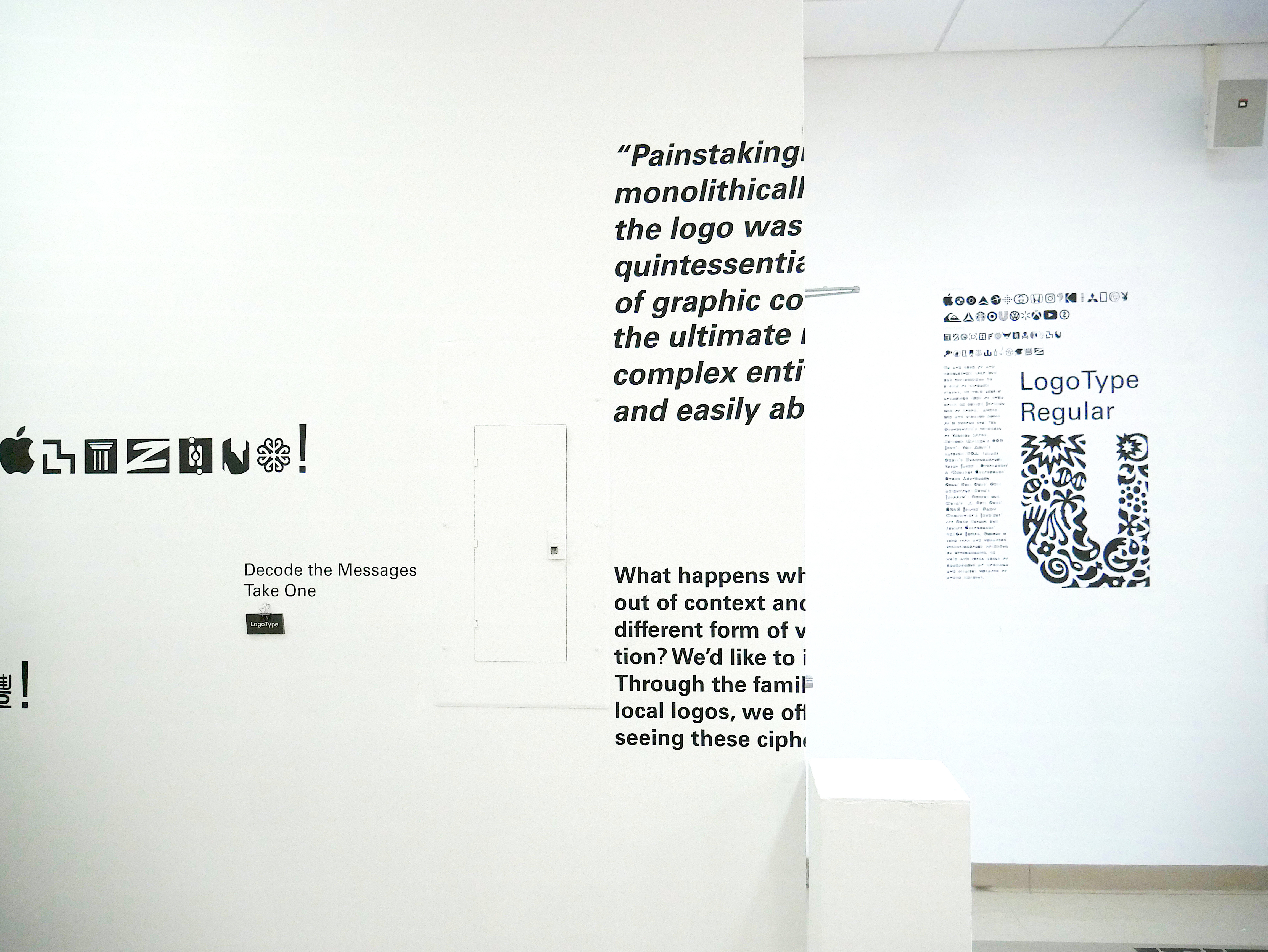
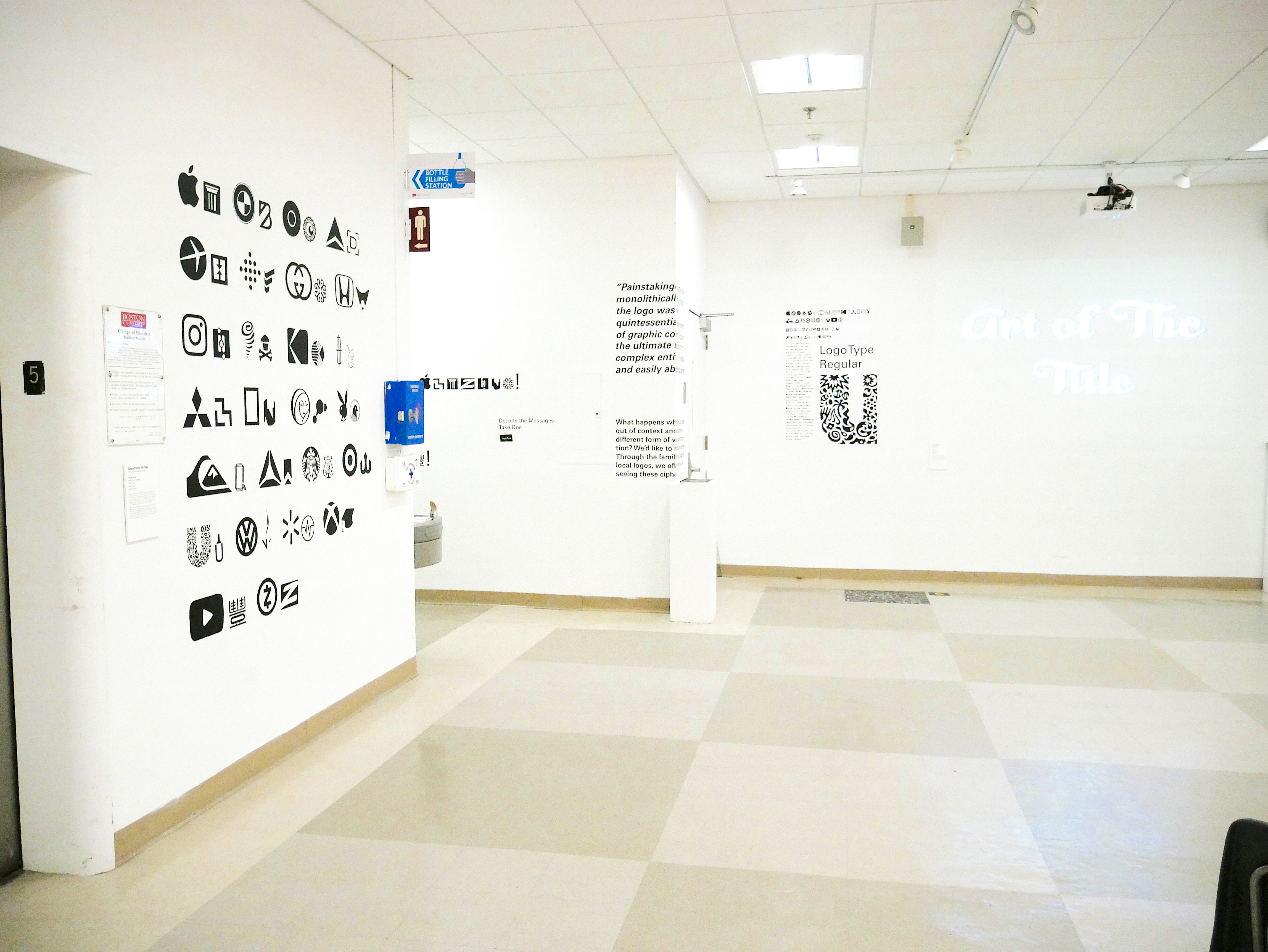
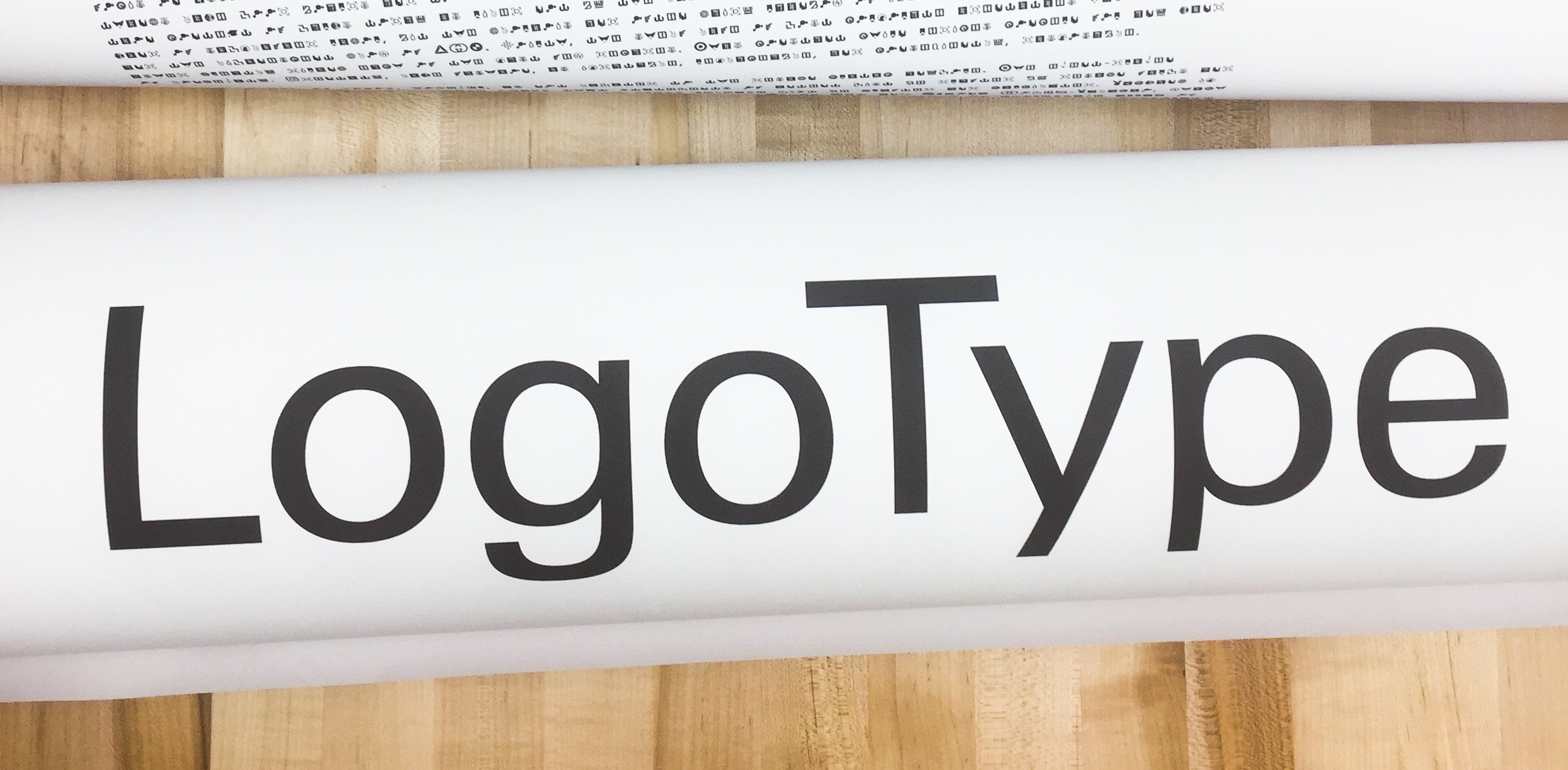
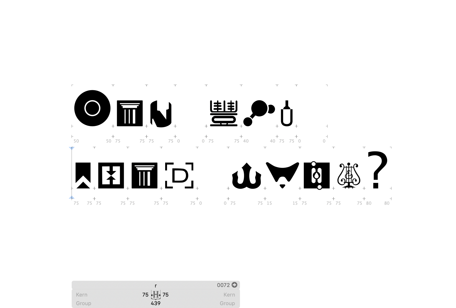
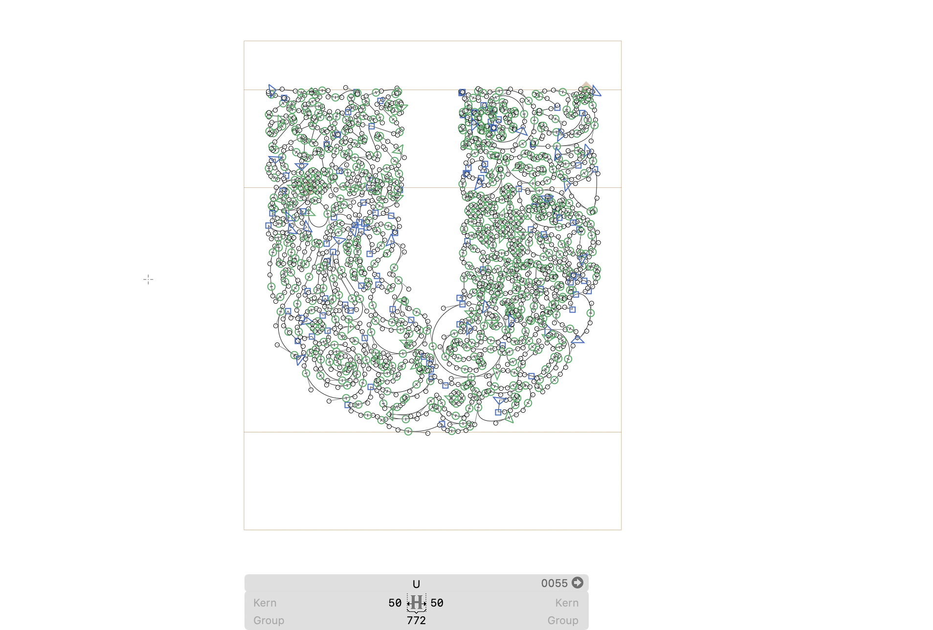
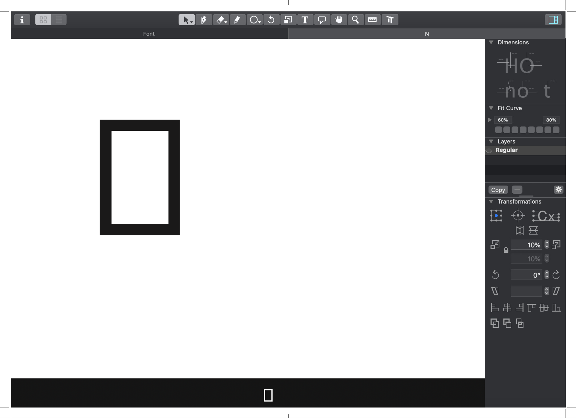
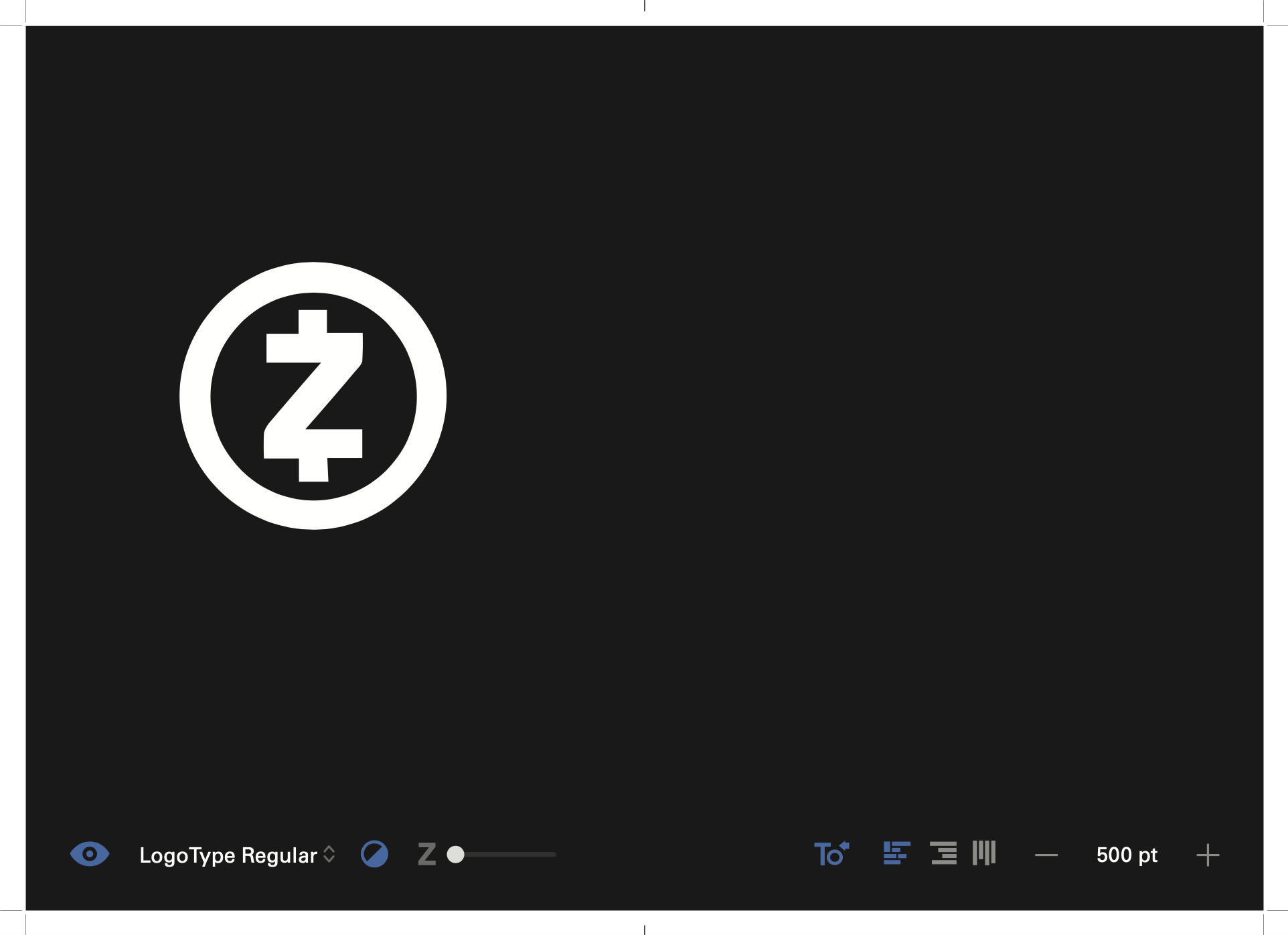
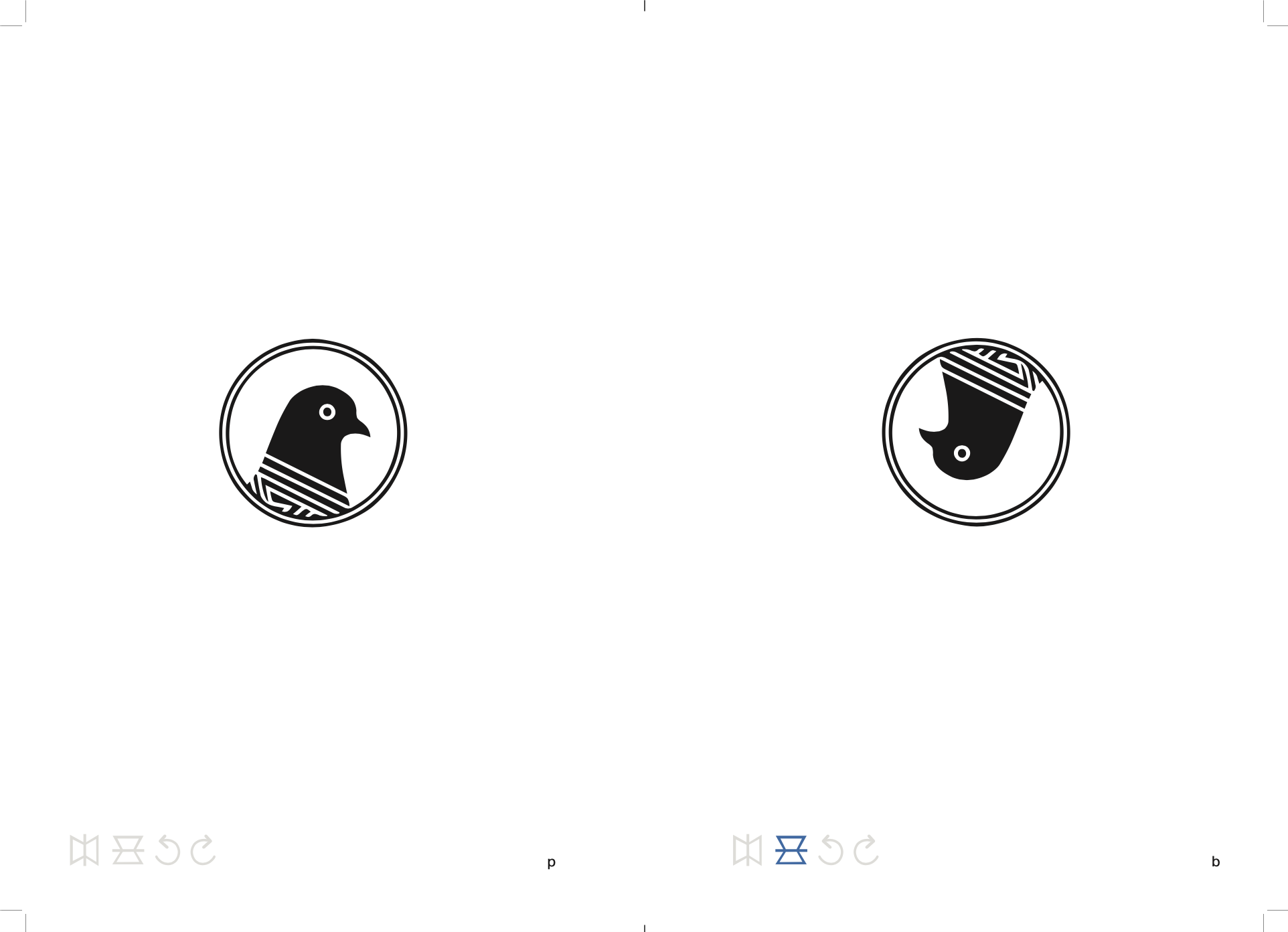
From this point we realized that re-contextualizing logos to create their own typeface would be a great way to bring these marks into a new space. With global logos, they are often easily recognizable simply because of the large influence they have. Their logos are printed everywhere, and we as people, are forced to view them. By taking familiar logos and bringing them into a different space we hoped that we would be able to offer our audience a new way to see something well known. We called this typeface LogoType.
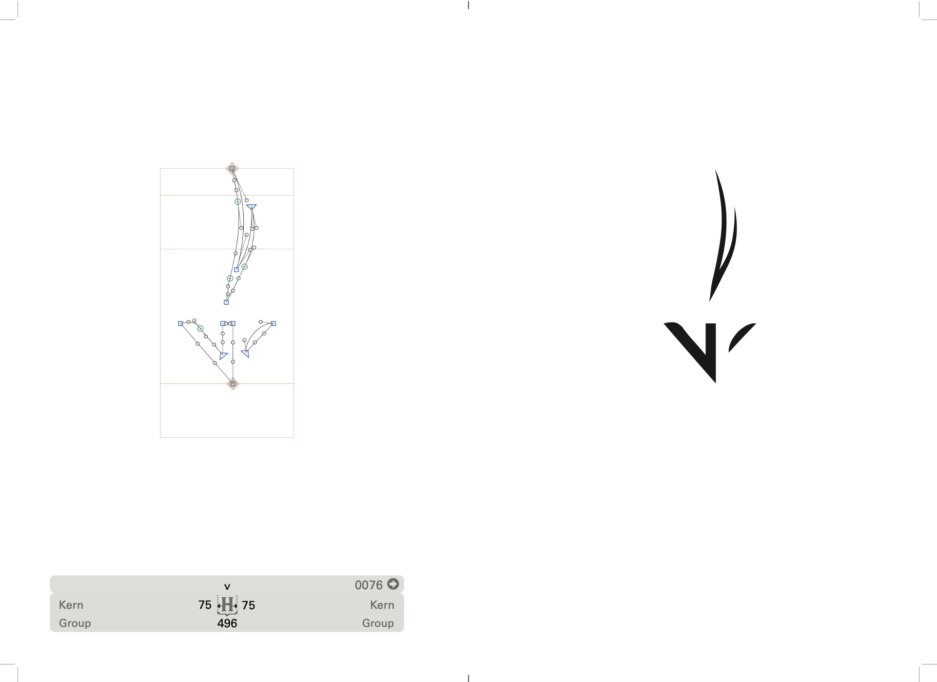
Creating LogoType was a feat in and of itself, simply because of the editing that had to be made in a font creating software called Glyphs. Each shape had to be adjusted, tweaked, and edited, so that shapes resembled the logos they were pulled from. When that was done, tracking was adjusted so that the shapes read well together, punctuation was added, and the file was exported as a .oft, a downloadable typeface.
LogoType is a combination of company logos (1) Uppercase: from world-renowned compnays (2) Lowercase: from local Boston organizations.
![]()
![]()
![]()
Creating LogoType was a feat in and of itself, simply because of the editing that had to be made in a font creating software called Glyphs. Each shape had to be adjusted, tweaked, and edited, so that shapes resembled the logos they were pulled from. When that was done, tracking was adjusted so that the shapes read well together, punctuation was added, and the file was exported as a .oft, a downloadable typeface.
LogoType is a combination of company logos (1) Uppercase: from world-renowned compnays (2) Lowercase: from local Boston organizations.


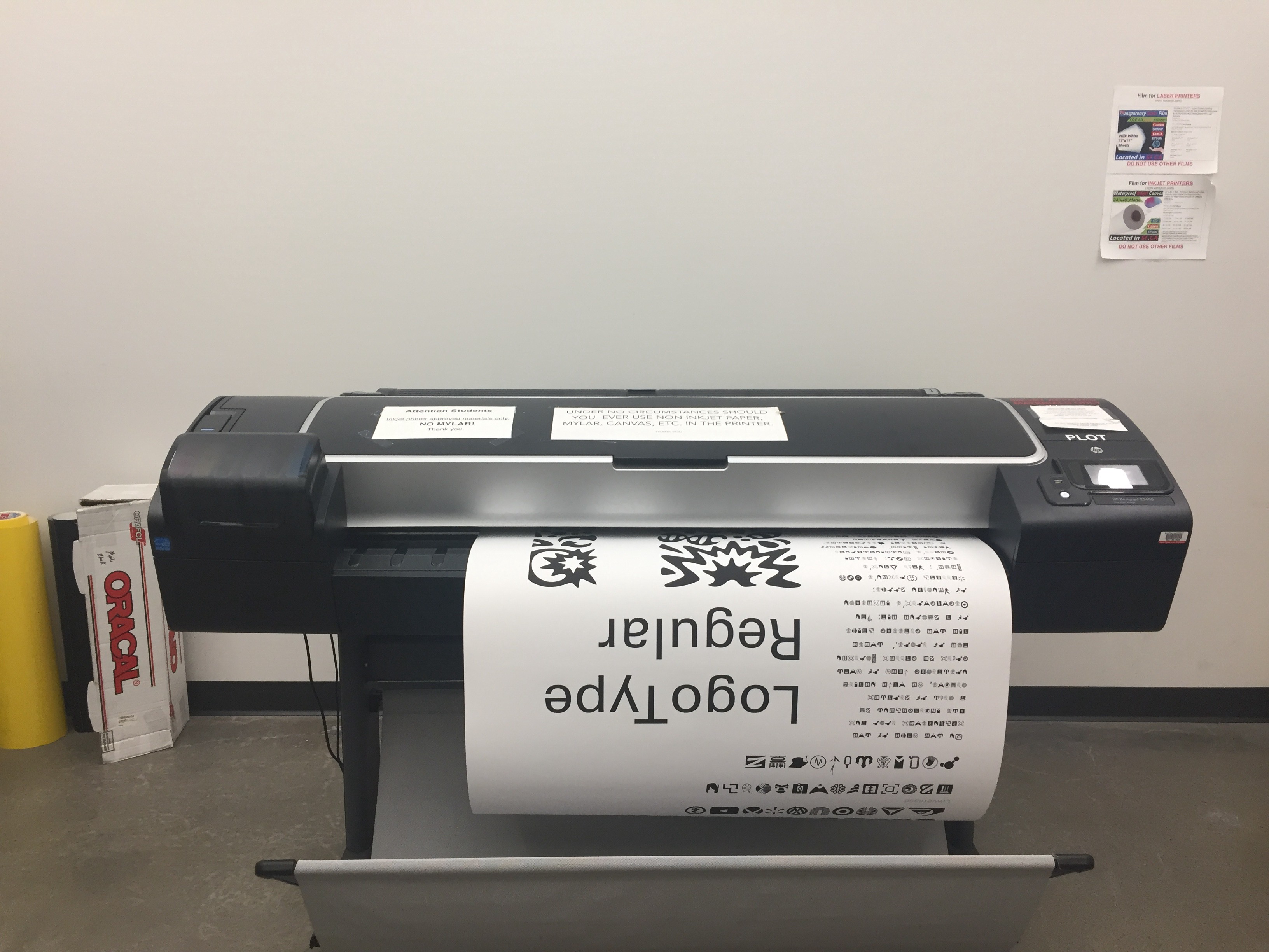
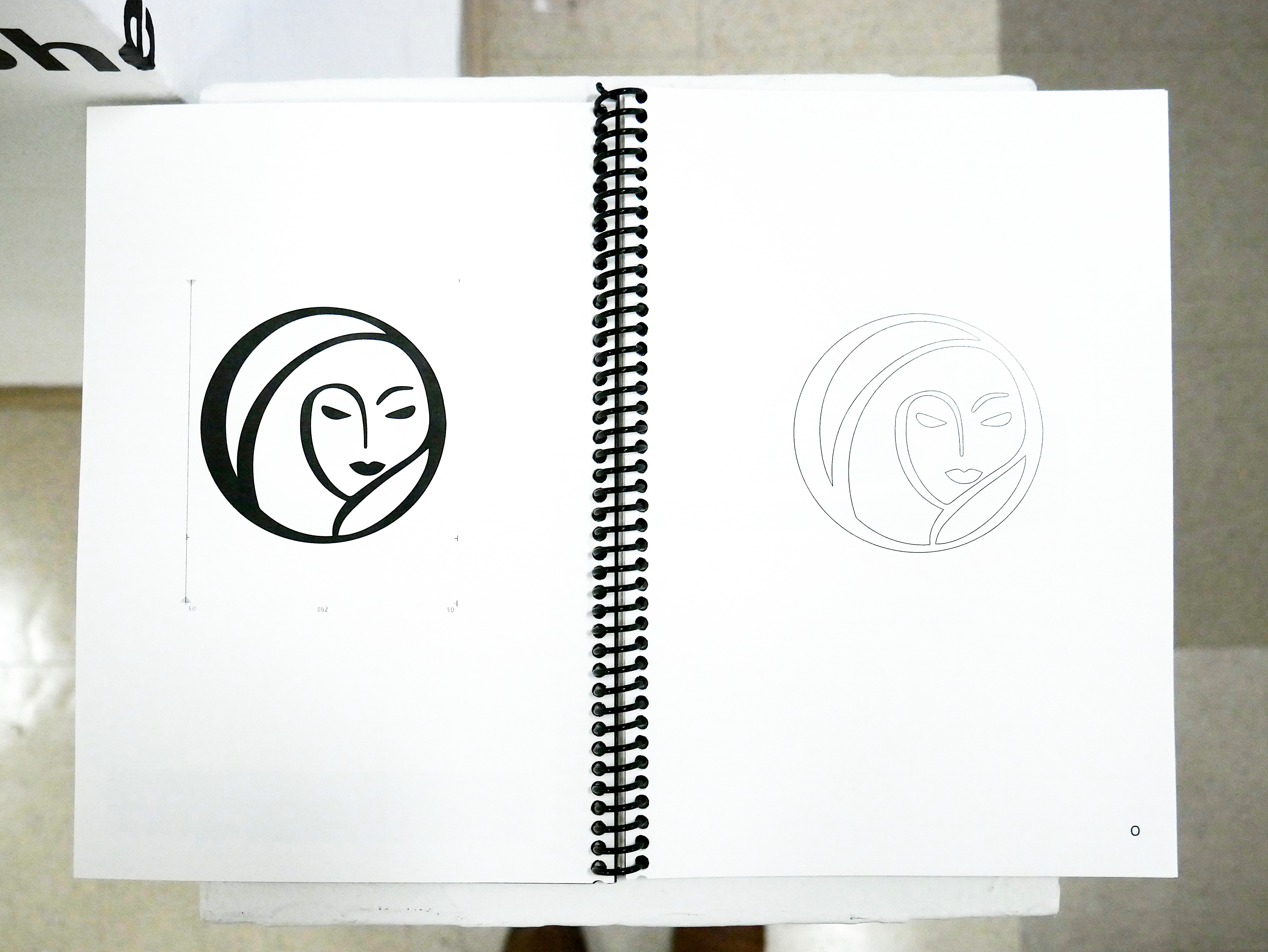
POSTER
The poster is represented as a type specimen, detailed shot of one of the letters, and a section of Andrew Blauvelt’s article typed out in Logotype.
![]()
![]()
![]()

VIDEO
The video is represented as the Graphic Design: Now in Production, Brand New Worlds with the subtitles in LogoType. This enabled the viewers to engage and try to de-code LogoType into something they could understand.
To view the full video, visit .
To view the full video, visit .
EDITORIAL
The editorial is represented as an in-depth view of our creation of the typeface in Glyphs. It is organized in the order the typeface was created and exploration of the program, ultimately giving the viewer a window into our process.
![]()
![]()
![]()
![]()
![]()
![]()
![]()
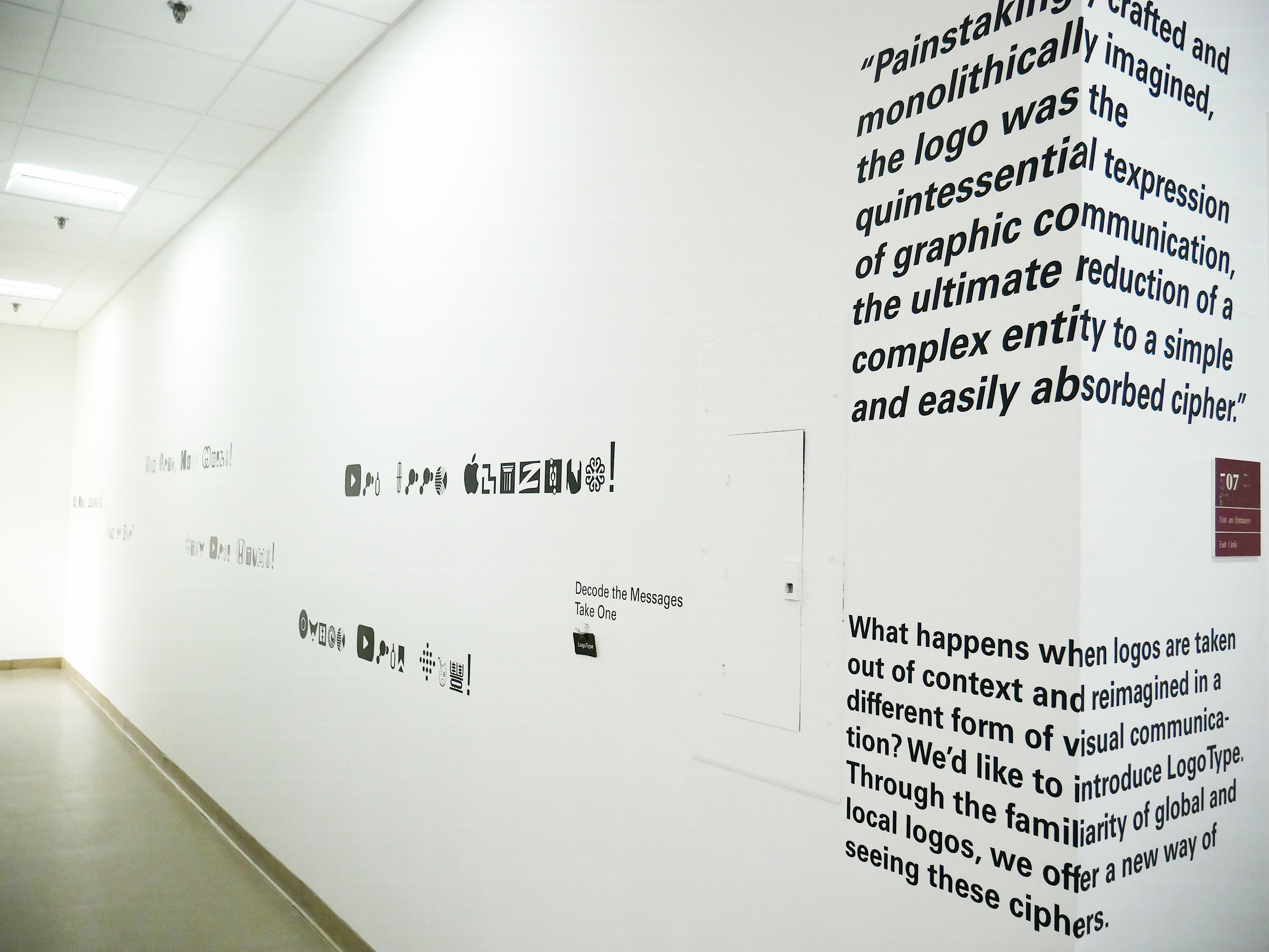
VINYL
Taking this idea a step further, we decided to include another element of interaction by spelling out phrases in LogoType and applying them to a wall in our exhibition space. This allowed us to activate a wall that wasn’t necessarily part of our space, and connect our design over two walls.
![]()
![]()

GALLERY