
s
design


Liberia Filippi Editrice
PROJECT SPECS
2018-9, 12 WEEKS
MY ROLE
GRAPHIC DESIGNER
PROGRAMS
AI CC, IN CC, PHOTOSHOP
TAGS
LOGO / SERIES REBRAND, PACKAGING, STATIONARY

OVERVIEW
Liberia Filippi Editrice is a rebanding project that introduces a contemporary take on one of Venice’s oldest bookstores and publishing house. The main components in this project includes designing a new logo and a book series published by Filippi.
CLIENT
Liberia Filippi Editrice is a Venitian bookstore / publishing house, with the original bookstore opening pre-WWI by Giovanni Filippi, Luciano and Franco’s father. Later on, the business split into two factions, resulting with each brother owning a separate location of the store.
AUDIENCE
There are two audience categories the rebrand targets:
» Venetian Residents » display a taste of Italian flair that resonates with the artistic atmosphere of everyday Venice
» Tourists » catch the attention of travelers and visitors admist many attractive destinations within Venice
» Venetian Residents » display a taste of Italian flair that resonates with the artistic atmosphere of everyday Venice
» Tourists » catch the attention of travelers and visitors admist many attractive destinations within Venice
GOAL
The goal is to produce a modernize logo and create packaging without losing the bookstore's history, apply clean Italian / Venetian graphic design features that would appeal to both residents and tourists.
GUIDE
The main colors in the Filippi palette inculdes French Puce (#521816) and Prune (#7A211E).

KEY DELIVERABLES
» a logo » finding the combination between modern Italian with the traditional logo’s historical story
» stationary » aletterheads, wrapping paper, etc. anything needed in a bookstore that requires utilization of the logo
» poster / postcard » additional marketing to drive foot traffic to the bookstore
» book series » provide a stylish touch to a play series published by Liberia Filippi Editrice
» stationary » aletterheads, wrapping paper, etc. anything needed in a bookstore that requires utilization of the logo
» poster / postcard » additional marketing to drive foot traffic to the bookstore
» book series » provide a stylish touch to a play series published by Liberia Filippi Editrice
LOGO

(Left) Emblem used by Franco Filippi (Right) Emblem used by Luciano Filippi, and is the original logo made by Giovanni Filippi
 (Left) Rounded rectangles process (Right) Version 1 of overlaying upon Times News Roman
The ‘F’ in Filippi was sourced from the original logo and served as inspiration for the base of the design — was handmade by Luciano Filippi, son of the founder of Liberia Filippi Editrice, which is still used today by one of his grandsons, Gianni Filippi.
Using the capital “F” from Times New Roman as the foundation, rounded rectangles are applied to occupy the negative space and supplement the spacing of each part of the F. Since columns is all over Venice and part of the culture, it was another characteristic added within.
Three identical serif shapes, left and middle, and a half elongated variation of the serif, top right, combine to form a new F. While the logo is completely recreated, the logotype resides as Times New Roman spelling Filippi.
 BW design of the logo
STATIONARY
All of the stationary papers follow European formats. Ex: Letterhead is sized A4.
![]()
Filippi Stationary Package: Letterhead, Envelopes, Thank You card, and Business Card
![]()
Filippi Merchandise Package: Pencil, Small Customer Bag, Tote Bag, Large Customer Bag, Gift Wrap, and Bookmark

Filippi Stationary Package: Letterhead, Envelopes, Thank You card, and Business Card
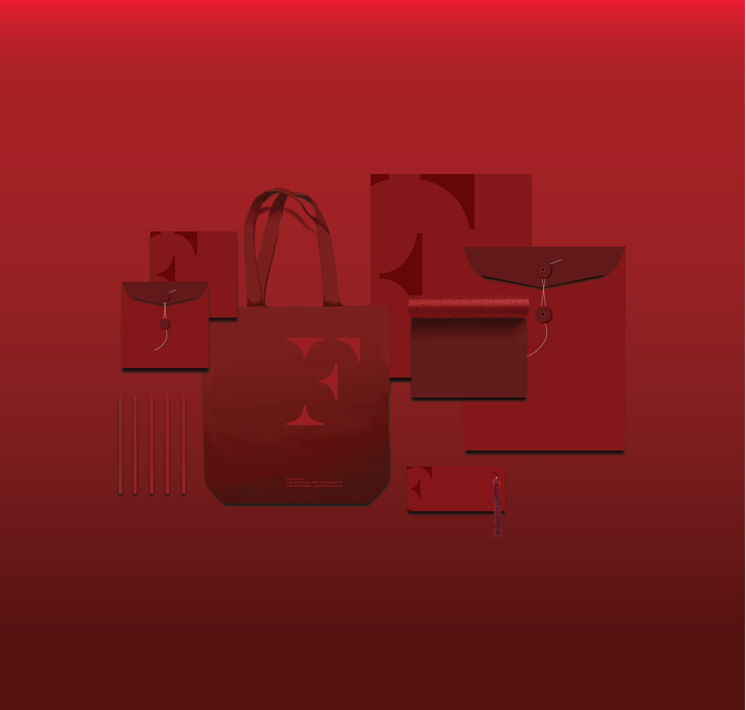
Filippi Merchandise Package: Pencil, Small Customer Bag, Tote Bag, Large Customer Bag, Gift Wrap, and Bookmark
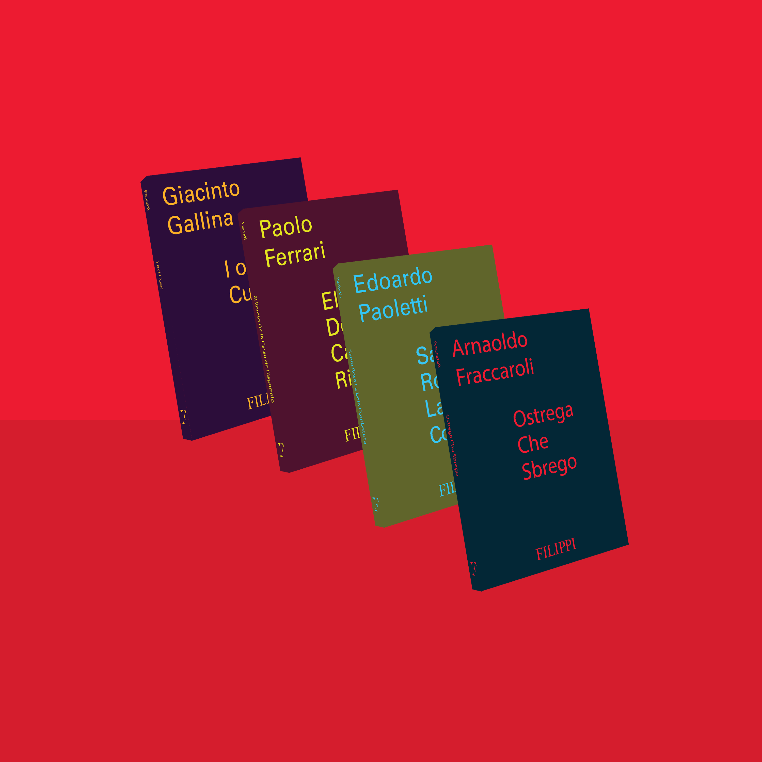
SERIES
The Filippi Series is based on an array of old Venetian plays published by Liberia Filippi Editrice. It originally has a beige cover with an engraved drawing on the center of the page. On the outside, a bold sans-serif was used to express the title, author, and publishing house, the while the plays themselves were printed in a small caps and regular serifs.
This new adaptation on the Venetian scripts introduced bright colors—inspired by Josef Albers’s color theory squares—for a more enticing first look, and unique text placement that takes in the essence of play speech going back and forth from one character to another. In addition to the remaking of the series, posters and postcards were produced to promote the series and attract Venetian residents, as well as tourists, to the bookstore.
![]()
![]()
![]()
REDESIGN
![]() Dimensions: 12cm x 16 cm; 1/4th in thick
Dimensions: 12cm x 16 cm; 1/4th in thick
![]()
This new adaptation on the Venetian scripts introduced bright colors—inspired by Josef Albers’s color theory squares—for a more enticing first look, and unique text placement that takes in the essence of play speech going back and forth from one character to another. In addition to the remaking of the series, posters and postcards were produced to promote the series and attract Venetian residents, as well as tourists, to the bookstore.

Ostrega Che Sbrego, Ca’ de Bou, and La Mama No More Mai are satirical comedies that are featured in the posters and postcards.


REDESIGN
Dimensions: 12cm x 16 cm; 1/4th in thick
POSTER / POSTCARDS
 The poster dimensions are A1, while the postcards are 22cm x 15 cm.