
s
log


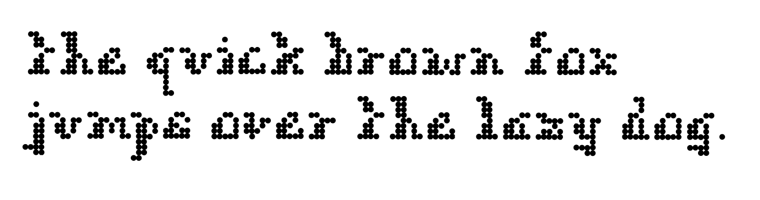
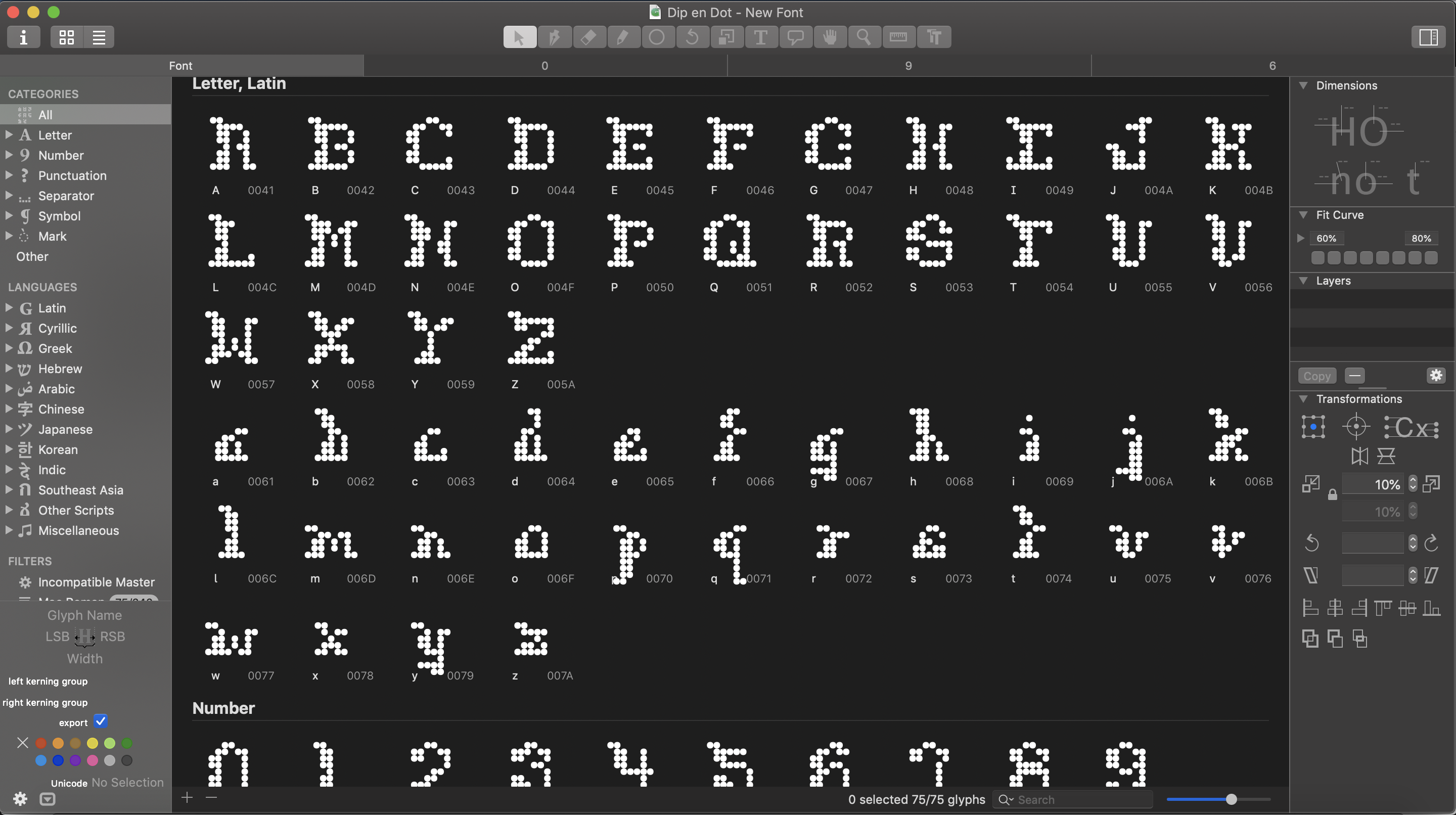
Dip en Dot
2019 | 2 weeks | Type Design | Bitmap | Illustrator | InDesign CC | Glyphs
Overview
Dip en Dot is an exploration into the origins of the first digital typefaces. The project analyzes the fundamentals in creating typefaces alongside the rise of technology, their intentions, and their restrictions.

Challenge
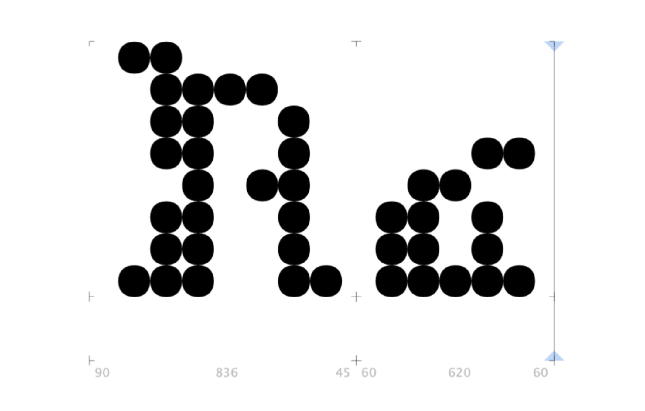
» Producing a prototype of a bit map typeface by designing letters on a grid of squares or dots
» No direct "staircases" (curves / diagonals in disguise)
» 26 letters, ampersand, and / or punctuations or numbers
Characteristics
» Curved ends on both the Capital and Lowercase letters
» Bolded on the left side
» All letters have a missing dot on their left side, all on the 4th row, as if the typeface are literally bitten
» X-heights have 2 dots
» Cap height have 2 dots
Bitmaps are known to be a clear, stationary typeface. In addition to that idea, the mockup also evokes a curvy appearance when it is seen father away; this implementation of fluidity adds onto the impression of an italic look.